The erotics of type – Max Bruinsma
in Sex Appeal, The art of allure in graphic and advertising design
ed. Steve Heller / Allworth Press, New York, 2000
–
« From the simple figure 69, to elaborate tongue-in-cheek exercises like Michael Worthington’s ‘Dominatrix’ typeface, typographers and type designers as well as readers (and censors) have used letters and ciphers to suggest ‘prurient’ content. Throughout the history of typography, the ‘abstract’ medium of type is employed to evoke eroticism, not by merely using the obvious words, but by using the letterforms: Copulating letters, erotic ligatures and the dot.
(i)
A simple way to describe how type can be erotic, or, if you want, pornographic, was demonstrated to me by typographer Chris Vermaas: “this”, he said typing some characters at my keyboard, “is the most concise manner to depict the female sex – only three strokes!” I had to admit that his typographic drawing was quite accurate, even if it wasn’t set in Dom Casual, which Chris stipulated would be the best typeface to render it in. I wondered how one could be so explicit with such limited means – was it my own dirty mind, or perhaps a congenial aspect of all pornographic imagination; that it needs only the slightest outline to conjure up the most detailed picture ?
In more puritanical times (and still today in some demure cultures), this same mechanism of imaginative crystallisation has been used the other way around, to censor from the written, public, imagination what cannot be kept from the mind’s p…..e eye. The most sophisticated use of this typographic device, these priggish but all too telling dots, is hidden in a 19th century German novel in which an officer – no gentleman, alas – admits his burning desire to a lady who cannot bear to hear this and thus faints, upon which he . This single dot, separated from the rest of the story by two spaces, tells of the unmentionable. For those who haven’t read the signs, it will become clear in the following chapters of the book that the lady has been ‘taken advantage of’ during this unfathomable moment, and, tragically, has become pregnant because of it. […]
.
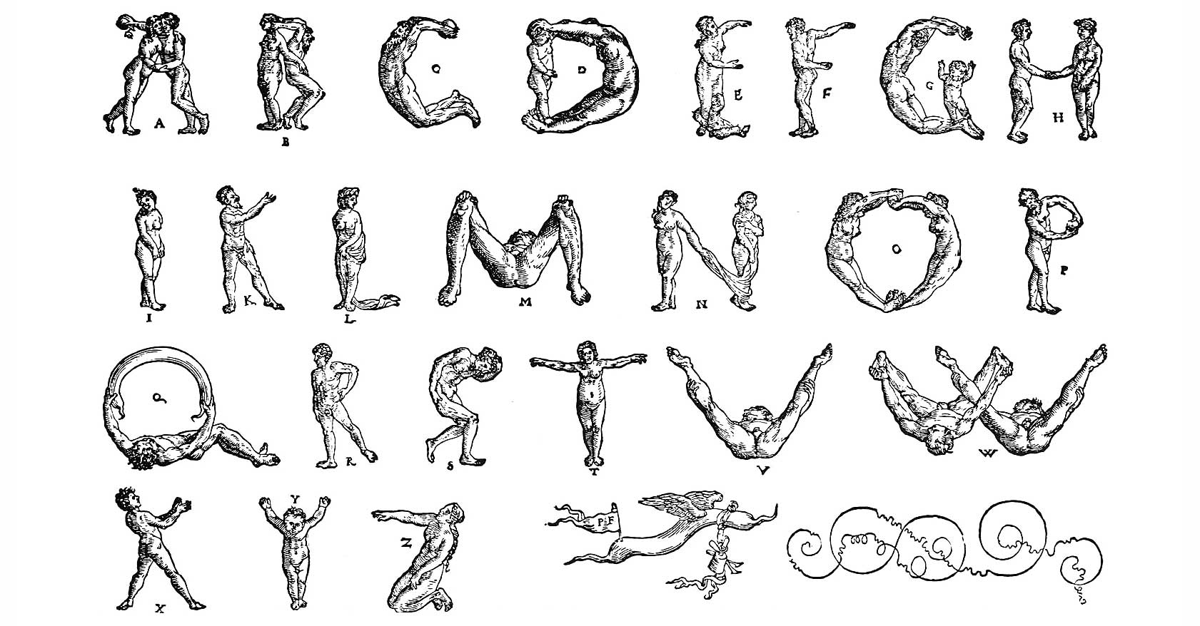
[…] From Peter Flötner’s alphabet of the 1530s to Anthon Beeke’s photographic version of the 1970s, engravers and typographers have seen human bodies in letterforms. Flötner’s all-caps ‘human alphabet’ has been widely copied, more or less explicitly. A German advocate of the Italian Renaissance, Flötner seems to have had no trouble with depicting classically nude figures in sometimes rather confronting poses, as in the ‘V’, or ‘M’, which both depict a man lying on his back with his bottom towards the reader, his legs spread wide in the manner consistent with the letters. Only in some later versions does the man wear briefs. Apart from the mere fact that the engraver uses nude human figures, the erotic content of these anthropomorphic alphabets is initially marginal: Flötner’s ‘A’ is made of two women kissing and holding each other’s arm, while the closest inter-gender contact is his letter ‘H’, in which a man and a woman hold hands. In both cases the arms constitute the horizontal bar of the letter. An Italian version of the ‘human A’ a century later (and not necessarily connected to Flötner), from Giovanni Batista Bracelli’s Alfabeto figurato of 1632, shows the letter as a man mounted by a woman – perhaps a typographic play on a Latin lover’s deepest fear, to be taken for a ride […] »
– Accéder à la suite de l’article –