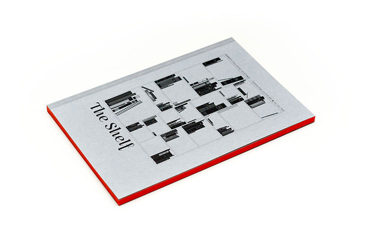
The Shelf
Colin Caradec and Morgane Rébulard, graphic and type designers.
Founders of The Shelf Journal and Company, Paris.
Hello Colin Caradec & Morgane Rébulard, how are you ?
Hello, we’re fine. We’re happy to finally reply to your questions, a year after we met at Les Journées Romandes de la Typographie.
Can you introduce yourselves ?
We are two graphic and type designers working in Paris. We met 8 years ago in class at the École Estienne were we studied typography. We also publish a bi-annual review about editorial and book design called The Shelf Journal.
Where does your interest in graphic design and type design come from ?
We both liked drawing when we were kids. Then we thought there was some money to make in graphic design, we were wrong, but we still like drawing a lot so we deal with it.
How did you come to start up the Shelf Company ?
We started the company with the idea of the journal. We wanted to publish the magazine ourselves so we created a proper structure in order to do it alongside our work for clients.
Can you tell us more about The Shelf Journal?
The Shelf Journal deals with editorial design, book design and what we call the “cult of the shelf” which is the inherent attraction of books toward their owners or readers.
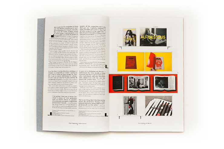
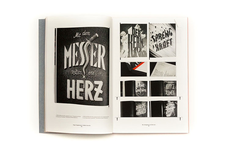
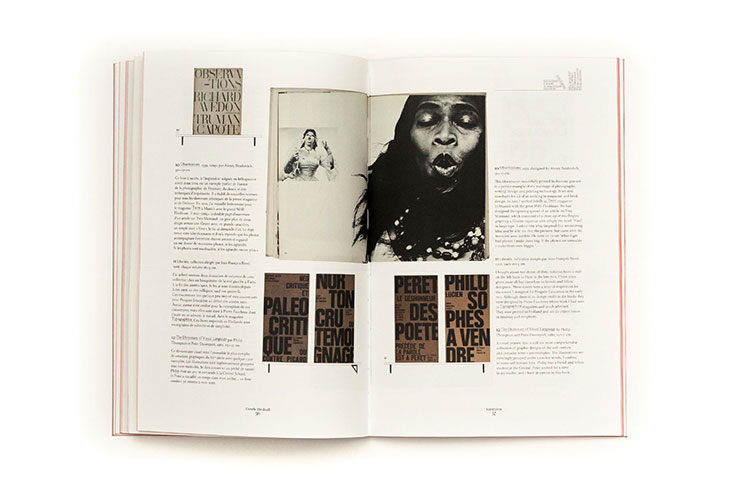
In term of content, we created different sections, which allows us to deals with articles of different kinds and topics. As an example, the central section of the Journal is called Me, my shelf and I. It consists in a meeting with a graphic designer (to this day: Pierre Di Sciullo, Derek Birdsall, Massin & Vier5) via a selection of books extract from his personal library. This is a good way to understand and appreciate how books interact with a designer’s work. On another hand, Shelf Mark is a section where we deal with books or documents from libraries which keep some rare or amazing pieces of exception or with libraries which stand for themselves as very peculiar.
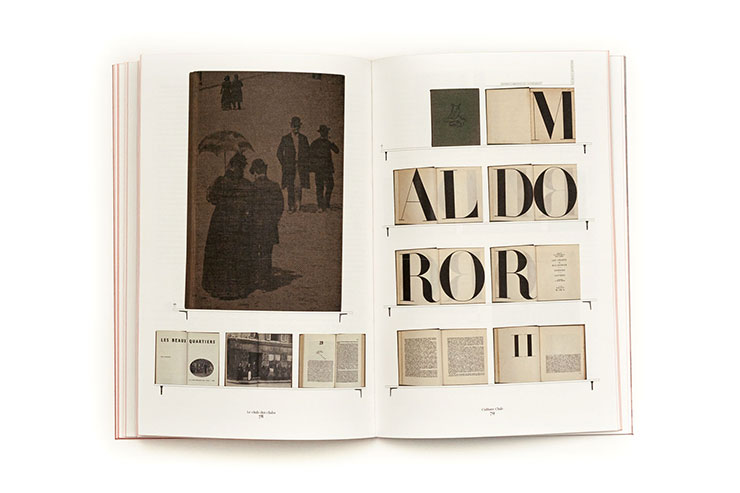
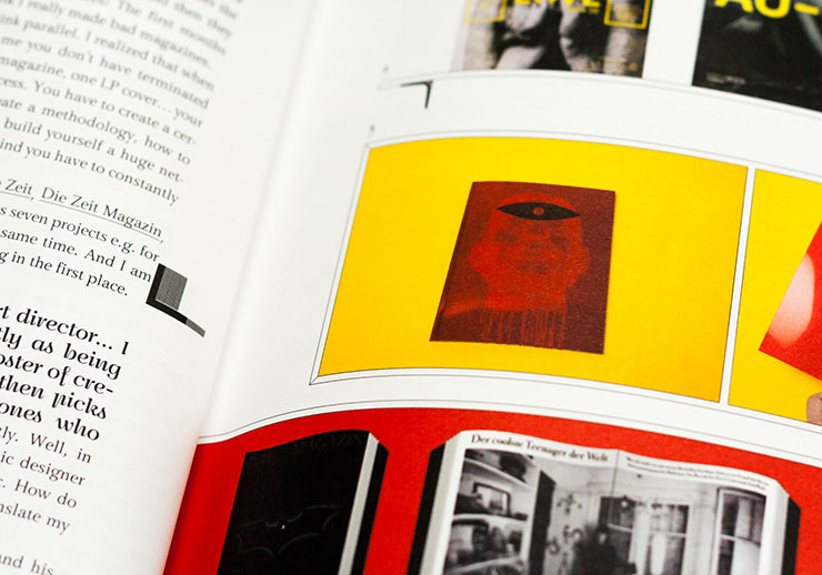
Dealing with its design, there are two pragmatic reasons which drove the layout of The Shelf where it is: The fact that French and English texts are always next to each other and the question about showing a book in a book. These two design problems are the core of the layout. They have been solved in a way some would say clever, others would say quirky… We often describe this work as functional-ornamentalism. We like to think ornaments as structural parts of the layout, not only as decoration. For instance, showing books in the Journal involved three types of photographs: frontal spread or cover shot, frontal single page shot, and close-up. In the first case, the photograph is put on a shelf, in the second case it’s hold by a “newspaper holding-clip” and finally in the third case we put the photograph in a frame. What drove us to make it this way is that it helps giving books their materiality back, and confers some space to pages. We like to design spreads as room where it would be pleasant to live and books like houses it would be fun to walk into. Each section of the Journal was also the occasion to draw esoteric vignettes, which evoke their different states of mind. What can be felt in our aesthetic is a will for mixing what’s good in tradition with what’s interesting in post-modernism.
→ Retrouvez la suite de cette interview sur Ligature.ch
Cette publication est possible grâce à l’amical partenariat entre LIGATURE.ch et index grafik.